Business.BT.com
Product Education

Understanding product features and benefits is crucial for users to fully appreciate what is available to them. With a diverse customer base that possesses varying levels of knowledge about broadband and its associated technologies, BT faces unique challenges. My main goals were to delve into the reasons behind the low conversion rates and the exceptionally high volume of call centre enquiries.
CLIENT
BT Group
ROLE
Lead Designer, User Testing, UX/UI Design
DATE
April 2021
Understand
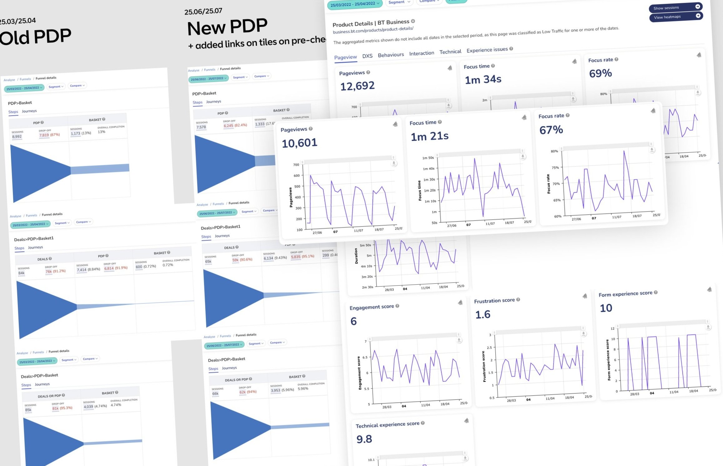
Analysis from user testing on the existing design revealed a significant issue. Upon examining the raw user tests, a pattern emerged where users would leave product detail pages to look up the meaning of a feature or benefit they were unsure about on a different platform.
This behavior was a stark indicator of the current product detail page's inadequacy. Supporting this, data analytics further highlighted the issue with detailed metrics on page views and drop-off rates.
Explore
Subsequent inquiries uncovered that the product naming conventions and the terminology employed throughout the journey were perplexing to users, leading to an increase in call centre inquiries. Drawing inspiration from an analysis of competitors, we identified ways to streamline the product detail page and optimise its effectiveness.

Validate
BT's existing approach involved creating a unique product detail page for each product offering. However, the slight variations between products made it challenging for users to compare them, and from a development perspective, maintaining these pages was cumbersome.
We tested a hypothesis that aimed at simplifying the interface by reducing the number of variants of pages and components. The existing two-column layout was proposed to be replaced with a single-column format to allow for a more efficient presentation of the substantial content.

Moving the design forward
-
Product detail page - Before
Users struggled with comparisons due to overwhelming content, and the two-column layout necessitated excessive scrolling through the page. All users expressed an interest for a product detail page.

-
Iteration 1
The first iteration enhanced content hierarchy, allowing for smoother page flow and clearer highlighting of features and benefits. However, introducing upsell items before users committed to a purchase led to confusion and comparison feature we missed.

-
Iteration 2
The last iteration further simplified the content, eliminated all upselling, adopted straightforward language, and incorporated iconography and visual cues for better understanding. Comparison tool was deemed valuable to users.

Validate
Stakeholders had varied views on the value of a product detail page. User analysis indicated that while not all users require extensive detail, those who do would greatly appreciate it.
Users valued the structured presentation of features in a grid layout, blending photography, illustrations, and iconography. This arrangement made the content easy to scan and visually appealing.

Create
I led the design process and creation of detailed Figma designs across all breakpoints, meticulously organising the product detail page into individual components. Utilising auto layout for each component ensured structural consistency, with uniformity across variants as a critical focus.
Working in tandem with content designers, we developed multiple copy versions tailored to the capabilities specific to the users' addresses.
Delivery
The second and most significant iteration of the product detail redesign led to a remarkable 12.5% uplift in conversion rates, outperforming our initial forecasts by 6.5%. Moreover, we observed a 22.1% decrease in call center inquiries and a 19.4% drop in basket abandonment rates, surpassing our expectations.
These outcomes far exceeded what I had predicted, and I took great pride in surpassing our stakeholders' expectations.

Reflection
Following the triumph of the second iteration, we consistently monitored and analysed data to identify further enhancements and future innovations. Leveraging my expertise, I transitioned to a new squad focused on improving a customer portal that was not meeting expectations.
Reflecting on my contributions, I was more than satisfied and happy, recognising that I had been a significant asset to the success of the new product detail page strategy launch.
