Business.BT.com
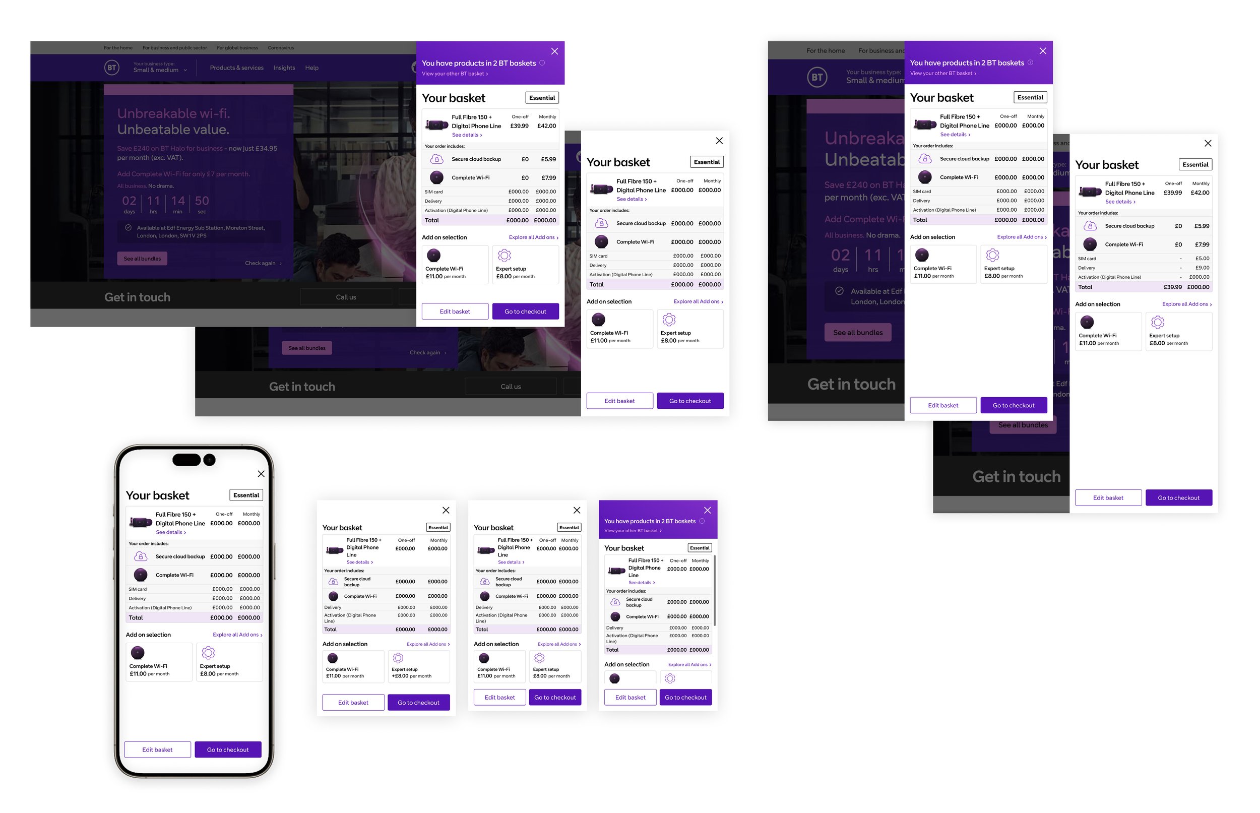
Mini Basket

As the lead designer heading the basket squad and the most senior across the entire purchase journey I led the squad initiatives in 2022. Our primary objectives centred around streamlining the purchase process by minimising the steps involved, enhancing the functionality of the global basket, and designing a more cohesive journey for returning customers.
CLIENT
BT Group
ROLE
Lead Designer, User Testing, UX/UI Design
DATE
July 2022
Understand
User testing revealed that a simplified, accessible basket summary improves the shopping experience. Our analysis of competitors' e-commerce platforms showed that implementing a mini basket, which offers quick access to a basket summary without leaving the current page, effectively addresses this need by streamlining complex purchase journeys.
BT Business featured a secondary basket for alternative products within its purchase journey. Recognizing the complexity this added, I identified that introducing a mini basket could significantly streamline the process, presenting a unique challenge to address.

Explore
The design of the mini basket's UI was guided by the main basket's aesthetic, ensuring a consistent look and feel across both elements. This approach underscored the importance of maintaining visual consistency throughout the shopping experience, harmonizing individual elements within the two baskets.
User testing initially led us to believe that simply displaying products in the mini basket would be the primary user desire. However, we found that users equally valued the ability to edit or remove items. Additionally, I identified a chance to incorporate upselling of products, similar to the main basket strategy, which was well-received and actively engaged with by users.

Validate
Initial user testing highlighted a challenge with activating the mini basket through the global navigation, which was beyond our direct control. This discovery prompted us to collaborate with squads outside of the purchase journey, as it became evident that broader enhancements were essential for the successful deployment of the mini basket.
To enhance the visibility of the mini basket feature, we underwent multiple design iterations to develop a revamped basket icon. This icon, along with its notifications, incorporated different states and micro-interactions to effectively capture users' attention and highlight the mini basket activation.

Create
A full responsive suite of UI was produced across all breakpoints for the mini basket and added to the global design system. A mobile first approach was taken when designing the mini basket and transitioning to larger breakpoints was made easier as the width of the mini basket remained close to the mobile view at all times.
Delivery
The launch of the mini basket resulted in an uptick in conversion rates, with 45% of orders proceeding to checkout through the mini basket in its first week. This percentage steadily rose, reaching 51% by the fourth week.
After the mini basket's successful launch, I turned to analyzing data and decibel heat maps to identify areas for enhancement. A minor modification in the wording of the upsell section, after being A/B tested and showing positive results, was promptly implemented and increased uptake shortly after.
